Contagion
Contact

Latitude Homes

Website Refresh

Website

    /    

Design

    /    

Brand

    /    

The Challenge

Over time, the Latitude Homes website had grown organically, with new pages and content added as the business evolved. The result was a lot to navigate, duplicated information and an inconsistent tone that no longer reflected the refreshed Latitude Homes brand. We needed to simplify the experience, make it easier for people to find what they were looking for, and bring the care and personality of Latitude Homes to life online. 
LatitudeHomes case study WEBSITE v1b

The Insight

Building a home already comes with a lot of decisions. Your website shouldn’t add to them. People need to be able to explore their options, find inspiration and understand what happens next without having to work for it. But simplicity couldn’t come at the expense of what makes Latitude Homes different: the feeling that behind the plans, packages and process are real local people who genuinely care about getting your home right.

LatitudeHomes case study WEBSITE v1b

The Action

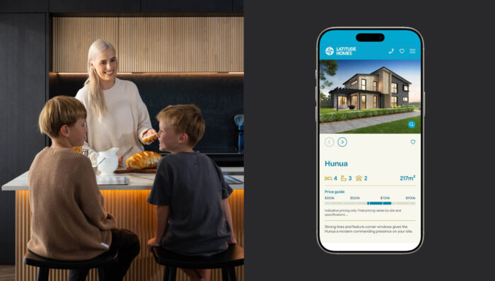
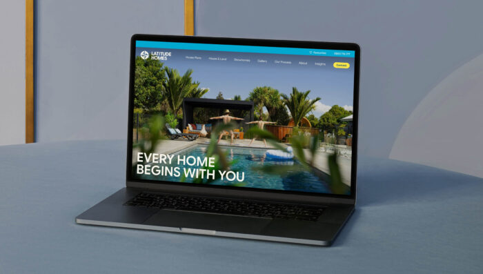
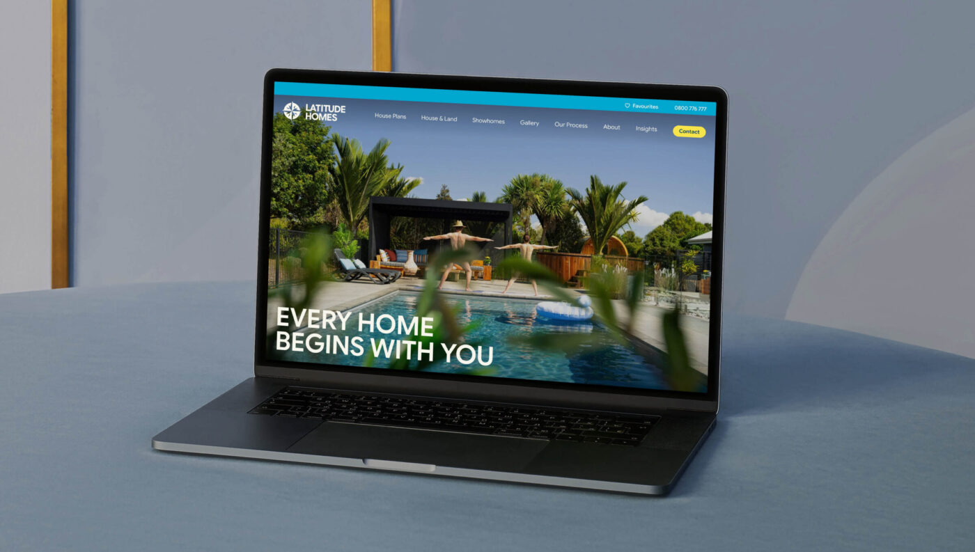
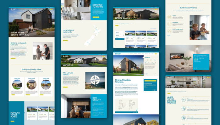
We stripped the website back and rebuilt the experience around what people actually need to move their build forward. We simplified the navigation and content, brought multiple pages together, made plans, House & Land packages and showhomes easier to explore, and introduced a favourites function so people could keep track of the homes they love. Then we rewrote the experience in the refreshed Latitude Homes voice: warm, straight-up, energetic and human, with clear pathways to local teams when people are ready to take the next step. The result is a website that feels simpler to use, more inspiring to explore, and much more like Latitude Homes.

LatitudeHomes case study WEBSITE v1b

Similar Work

cross